|
|
Post by JTagmire on Dec 10, 2008 7:38:45 GMT -5
I like both of the bottom ones. The purple jacket matches that sex buckle in a Samuel L. Jackson sort of way.
|
|
grug
Gad about Town
 
Posts: 351
|
Post by grug on Dec 10, 2008 8:00:14 GMT -5
question - is the sex pirate standing on boot stilts? No, he tucks his pants into his boots. |
|
|
|
Post by Michael on Dec 10, 2008 19:02:55 GMT -5
This looks awesome!!!
On the first one, I like the first row second version. With the other one I like the second one.
Can't wait to see more of this.
|
|
grug
Gad about Town
 
Posts: 351
|
Post by grug on Dec 10, 2008 20:11:56 GMT -5
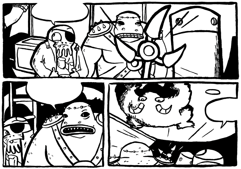
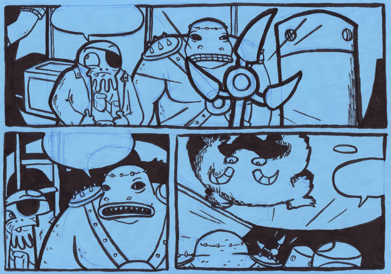
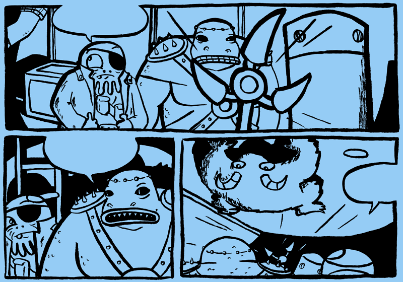
I did this last night as a bit of practise to help me get to know the characters a bit better.  I drew it on blur card, and here is the untouched up version:  And the still blue-but-touched-up-version.  |
|
grug
Gad about Town
 
Posts: 351
|
Post by grug on Dec 10, 2008 20:12:44 GMT -5
(By the way, this isn't anything from the actual comic)
|
|
|
|
Post by JTagmire on Dec 10, 2008 20:42:36 GMT -5
Oh man.... I can't wait. That looks really cool.
|
|
|
|
Post by Luke on Dec 10, 2008 20:46:51 GMT -5
Grug, that is so fantastic. This is going to be the best thing ever. I adore how this looks.
I am intrigued by that scene too. Now I wish it was in the actual comic. I want more weird stuff like ceiling goats. Issue two maybe.
|
|
grug
Gad about Town
 
Posts: 351
|
Post by grug on Dec 10, 2008 20:51:24 GMT -5
Thanks guys! And Luke - go for it! Maybe their ship is infested with them?  Did the fact that the robot's hand is a torch come across ok? |
|
|
|
Post by Luke on Dec 10, 2008 20:54:57 GMT -5
It did, yeah. I also love the lips that appear on Funf in the bottom left panel. That's a great look for him. But I also like that they're only visible in certain expressions.
I have some ideas for the second story and ceiling goats could be a great addition.
|
|
grug
Gad about Town
 
Posts: 351
|
Post by grug on Dec 10, 2008 20:56:47 GMT -5
Haha, cool. The lips thing was an accident, but I like it too.
|
|
|
|
Post by Luke on Dec 10, 2008 21:00:36 GMT -5
I might do a quick colour job to get a feel for it and how they mesh. I'll do two versions. One where they are in their standard colours just so we can see what they look like together, and then I'll try one where they're affected by the light.
|
|
|
|
Post by Luke on Dec 10, 2008 21:09:54 GMT -5
In the meantime, here's a colour test for Furious Bruce:  No colour test for PK. I'm pretty happy with him here:  |
|
grug
Gad about Town
 
Posts: 351
|
Post by grug on Dec 10, 2008 21:15:13 GMT -5
My favourite Bruce's are the first and second. I like the idea of a less colourful character and he'd be the one to be that. Also, I agree PK's great! Look forward to seeing the comic in colour!  |
|
grug
Gad about Town
 
Posts: 351
|
Post by grug on Dec 10, 2008 21:16:24 GMT -5
(I also like the first one on the second line)
|
|
|
|
Post by Luke on Dec 10, 2008 21:18:37 GMT -5
Didn't want to sway opinion, but my favourite is the second one on the top row. If PK is red, then it's probably best that Bruce isn't.
Bruce should be pretty stealthy anyway. I know I still gave him some bright bits there but at least they're armoured.
|
|