|
|
Post by Luke on Nov 30, 2008 21:04:58 GMT -5
Happy December. This thread is for all the crazy shit you will/have accomplished this week.
I'm hoping to start work on writing my theatre monologue, and to do some editing on my grandfather's new book. Also advent calendar madness starts today!
|
|
grug
Gad about Town
 
Posts: 351
|
Post by grug on Dec 1, 2008 1:19:15 GMT -5
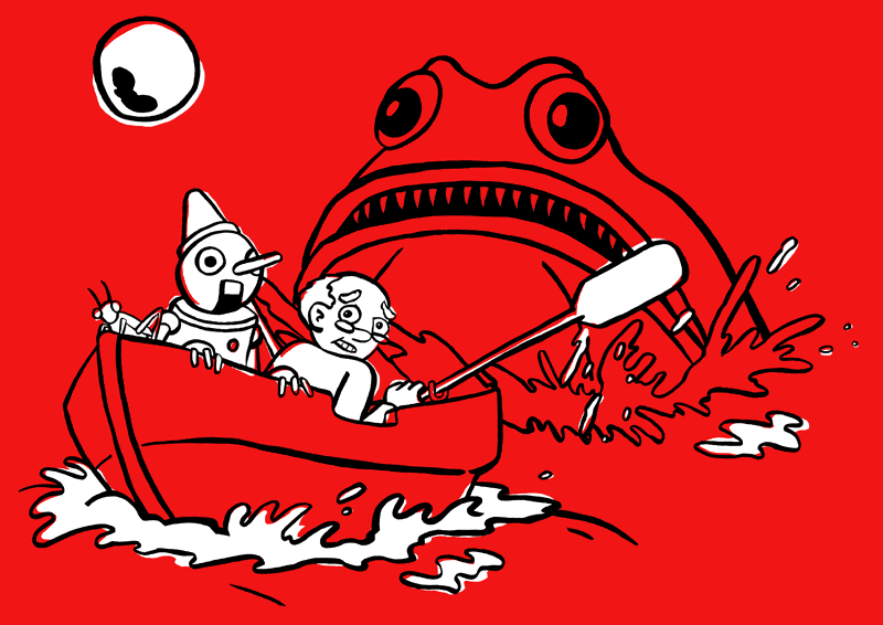
I am working on a t-shirt design for the band I do the art for. I have to work their logo in somehow (either on the front or the back. I'm undecided so far) but the guy really wanted two colours, and he urged me to use a red shirt with black and white ink, and I'm like, sure, whatever. So anyway, this is what I've done:  I think I'm pretty happy with it. |
|
|
|
Post by Suzanne on Dec 1, 2008 1:39:15 GMT -5
holy crap, can I borrow this and make it my desktop wallpaper?
|
|
|
|
Post by Luke on Dec 1, 2008 2:03:15 GMT -5
Yeah that looks fantastic Grug. Love it.
|
|
grug
Gad about Town
 
Posts: 351
|
Post by grug on Dec 1, 2008 2:21:40 GMT -5
holy crap, can I borrow this and make it my desktop wallpaper? haha, of course. If you want a specific size, let me know.  And thanks Luke! Hopefully the band goes for it. |
|
grug
Gad about Town
 
Posts: 351
|
Post by grug on Dec 2, 2008 0:12:26 GMT -5
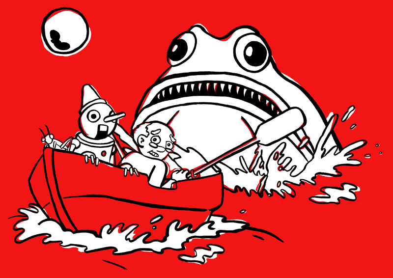
Shirt revision. I think it's better, any comments/suggestions?  |
|
|
|
Post by Luke on Dec 2, 2008 0:34:05 GMT -5
I did like the original focus on the two guys in the boat with the creature looming. This version gives the whole scene more focus, so it all seems of equal importance, rather than the boat dudes. So I guess it depends on what's more important for you.
Have you considered splitting the difference and putting white on just the creature's eyes and lip?
|
|
grug
Gad about Town
 
Posts: 351
|
Post by grug on Dec 2, 2008 0:42:18 GMT -5
Yeah, I tried that and it didn't really work for me.
The best solution would be to add another colour, I guess, but that's not an option.
Ah well, the band like this version. I'm just trying to figure out where to put their logo.
|
|
|
|
Post by Luke on Dec 2, 2008 0:44:22 GMT -5
It's a really balanced version. I dig it. I like the three colours a lot. I think another would diminish it.
|
|
grug
Gad about Town
 
Posts: 351
|
Post by grug on Dec 2, 2008 0:46:32 GMT -5
(By the way, I agree with you, I preferred it when the focus was on Pinocchio and Gepeto, but they wanted Monstro brought out too)
|
|
grug
Gad about Town
 
Posts: 351
|
Post by grug on Dec 2, 2008 0:50:58 GMT -5
Oh, and thanks! You're right, of course, and extra colour would take away from it.
(PS, the next Dungeon book - book three from the main continuity - comes out in February!)
|
|
|
|
Post by Luke on Dec 2, 2008 3:44:02 GMT -5
Yeah I was reading that only 1/3 or something of the Dungeon books had been translated! That's crazy!
|
|
grug
Gad about Town
 
Posts: 351
|
Post by grug on Dec 2, 2008 5:00:08 GMT -5
Have you seen the Dungeon site? It is so great, but I wish it was in English.  www.pastis.org/donjonland/ www.pastis.org/donjonland/Also my A3 scanner has arrived! Can I make it work?! |
|
|
|
Post by Luke on Dec 2, 2008 5:53:44 GMT -5
Oh man, you can buy a Marvin figurine!
|
|
|
|
Post by Suzanne on Dec 2, 2008 6:08:08 GMT -5
Totally up for more Dungeon. For some reason it sits alongside Tintin and Asterix in my mind. Which is weird because its aimed older. I think its because its colorful and in a glossy softcover format and theres questing.
This week will be an odd one for me. I will be ramping up the blogging again due to the ADVENTuring and general christmas gushing. I'll be filling the Nano void with some writing I'm doing for the Solo Spot show in feb/march, cos I really need to do that. yep. So thats my week.
|
|